Many websites and infographics I have consulted claim that on Twitter, shared images, images that users attach to their tweets as opposed to profile and banner images, are always displayed in a 2 to 1 ratio, whether in-stream or when “expanded.”
From my experience it seems like expanded images display nicely no matter the image’s actual dimensions. I’m more interested in the in-stream preview, and the ratio in which it is displayed. If the image’s dimensions do not line up with the preview dimensions, the preview is partially cut off. So in order to get an image to display fully in the preview, its dimensions need to match the preview’s dimensions.
Here’s one such infographic from Sprout that claims to be always up-to-date:

And one from a Constant Contact, which makes a separate specification for in-stream previews, which it says are also displayed 2 to 1:

Buffer says 1,024 x 512; Visually says appears in stream collapsed at 506 x 203px, both of which are a 2 to 1 ratio.
In my somewhat-hasty search this morning I didn’t find any pages live on twitter.com or support.twitter.com that claim the 2 to 1 ratio, though. The API docs have a page dedicated to “Summary Card with Large Image”, but I think that’s Twitter’s relatively new feature of pulling in preview photos when users include a link in their tweet copy.
So it’s 2 to 1, right? Let’s experiment for a minute, shall we?
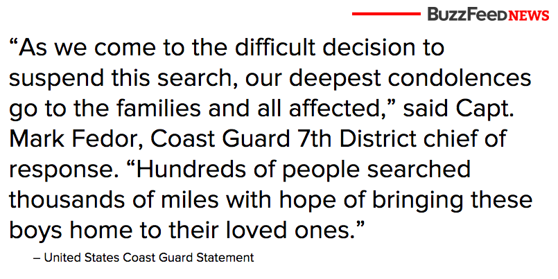
Here’s a tweet I sent last night with an image generated by a new tool I’m working on.
The Coast Guard has suspended its search for two missing teens off the Atlantic coast pic.twitter.com/aePkfIa7TT
— Sam Schlinkert (@sts10) August 1, 2015And here is what that tweet looks like on my profile page on my laptop, unexpanded:

Here, in the name of transparency and redundancy, is the actual image itself, which I contend measures almost exactly 600px by 300px.
But here’s the problem: Twitter’s iOS app seems to display images at some fatter ratio in-stream. Here’s a screenshot I took of my profile page using Twitter’s iOS app on my iPhone 6:

See how the sides are cut off? It looks more like a 1.75 to 1 ratio to me, maybe even something weird like 1.78 to 1.
Am I going crazy? Is this other ratio documented anywhere? Clearly how images are displayed in-stream in the official iOS app should be relevant information to anyone seeking an infographic of social media image dimensions, and I would think something that Twitter would want readily available to social media editors and marketers. As a developer I’m now forced to choose whether to optimize for mobile or desktop, or to generate images that split the difference, displaying sub-optimally in both settings. Am I missing something?!
Update:
I did a little more ~research~ yesterday and looked at how some other media organizations sized their screenshots:
OK so this one is 599px by 337 (1.777448071 to 1) https://t.co/htZQM1Xe8L
— Sam Schlinkert (@sts10) August 6, 2015And the @nytimes rolls with 600 x 336 (1.785714286 to 1). Maybe that's a good split https://t.co/LedmUvDUV3
— Sam Schlinkert (@sts10) August 6, 2015Ah but Vox does straight 600 x 300 (2 to 1) https://t.co/bLbM9xb6s5
— Sam Schlinkert (@sts10) August 6, 2015Interesting: @WSJ uses 599 by 318 (1.883647799) https://t.co/2WQm2vRhlo
— Sam Schlinkert (@sts10) August 6, 2015I’ve concluded that a ratio around ~1.74 to 1 is solid for mobile, but that desktop likes 2 to 1. I’m thinking about compromising more on the mobile side and doing 1.8 to 1 (so right about with the Times).